Redesign Proposal
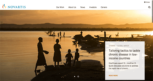
As a leading pharmaceutical company with over 200 products and serving across 150 countries, GSK.com’s website serves as the company’s face to its investors, media, healthcare professionals, partners, and consumers. The homepage, especially, should be a place where we set the brand’s image and be the portal for all of its users, not any specific type, to guide them to the right content they are looking for.
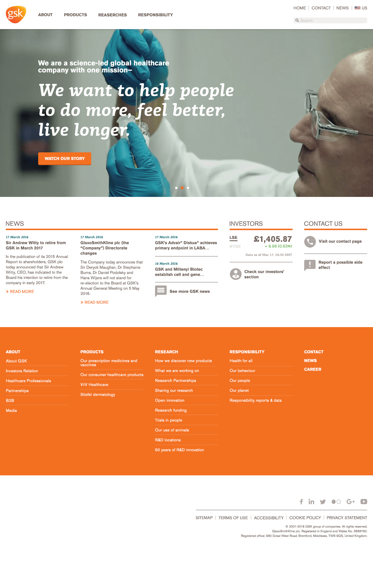
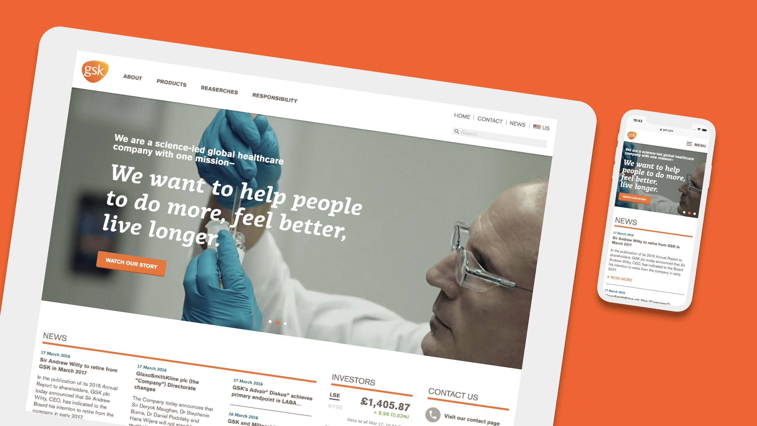
Currently, the website’s home page has two sets of navigation systems, three tiers of content areas, and one footer area. All of this made the page hard to navigate, concentrate and created a cluttered look and feel. Therefore the goal of this project will be focusing on modernizing, simplifying, and consolidating the homepage and the global navigation system. Provide a landing page that’s easier to use for all users.
Research
-
Competitors
-
-
Additional Requirements
- Accessibilities support
- Mobile support
- Social media support
- Internationalization support
-
Brand Style
-
Color
- Orange: 243, 112, 33 #f37021
- Teal: 21, 113, 125 #15717d
- Dark Gray: 114, 99, 93 #72635d
- Mid-Gray: 173, 167, 163 #ada7a3
-
Typography
- Akzidenz Grotesk Pro
- PF Centro Slab
-

Restructure
Starting with restructuring, we took a look of the current work-flow and discovered
- The two different top navs with equal weight made it hard to focus for users
- The top navigation area took over almost a quarter of the space which wasted spaces.
- The hero section isn’t providing an engaging image.
- The 8 different types of content in the content area aren’t all that necessary to be featured on the homepage.
- Which also buried the most important CTAs
- Footer isn’t really serving any meaningful functions besides legal information and social links.
So we decided to re-organize the navigation system and consolidate the content area. Provide only the necessary information to users on the homepage and make it easier for them to find the next step to do.
