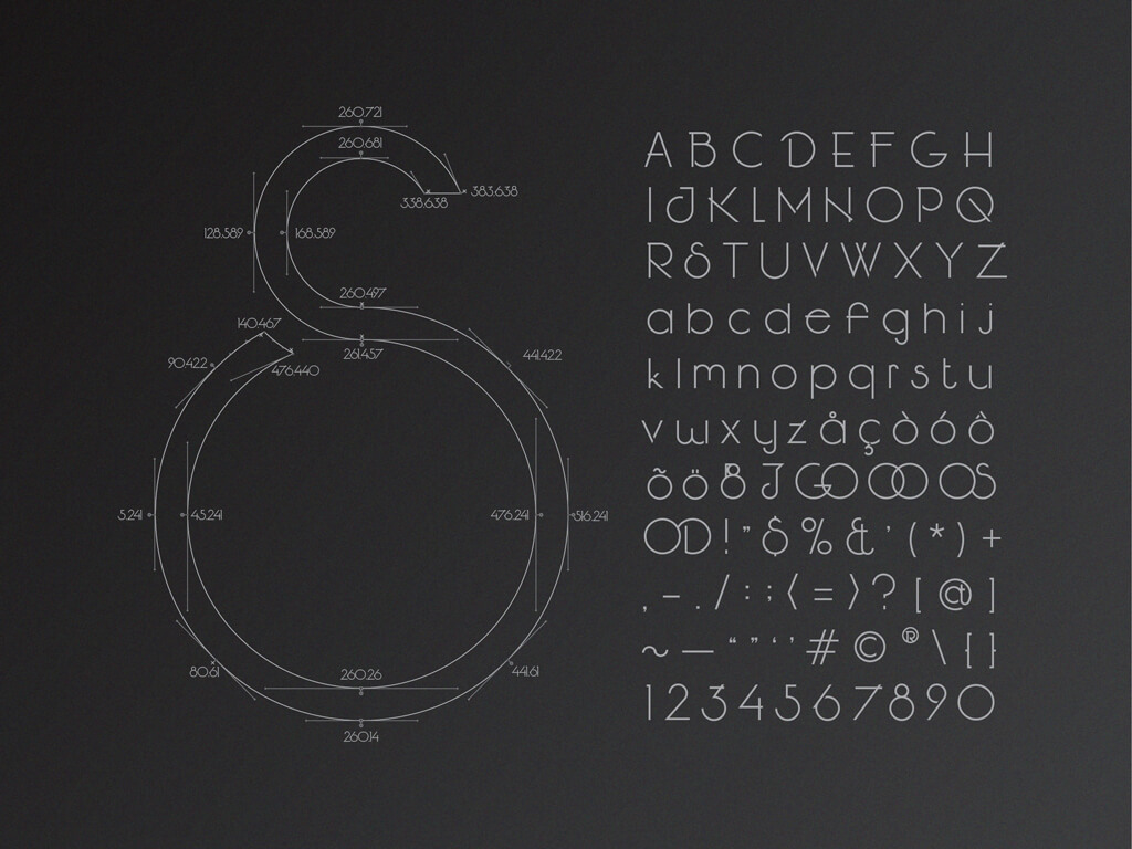
J is an original typeface designed to represent my style and aesthetic view based on the beauty of early 20th century architecture and industrialized style, Art Deco, Streamline Moderne and Organic Architecture. J is a very narrow, skinny typeface with extremely wide circles. By using only the geometric curves and lines following the rule of thirds, J shows off its elegance and sculptural construction. In this typeface, bowls never connect with straight lines on one side, left-right diagonal lines clear the right side, and multiple overshoot lines occur when two straight lines meet. J should not be used smaller than 12pt in print and 14pt on screen.