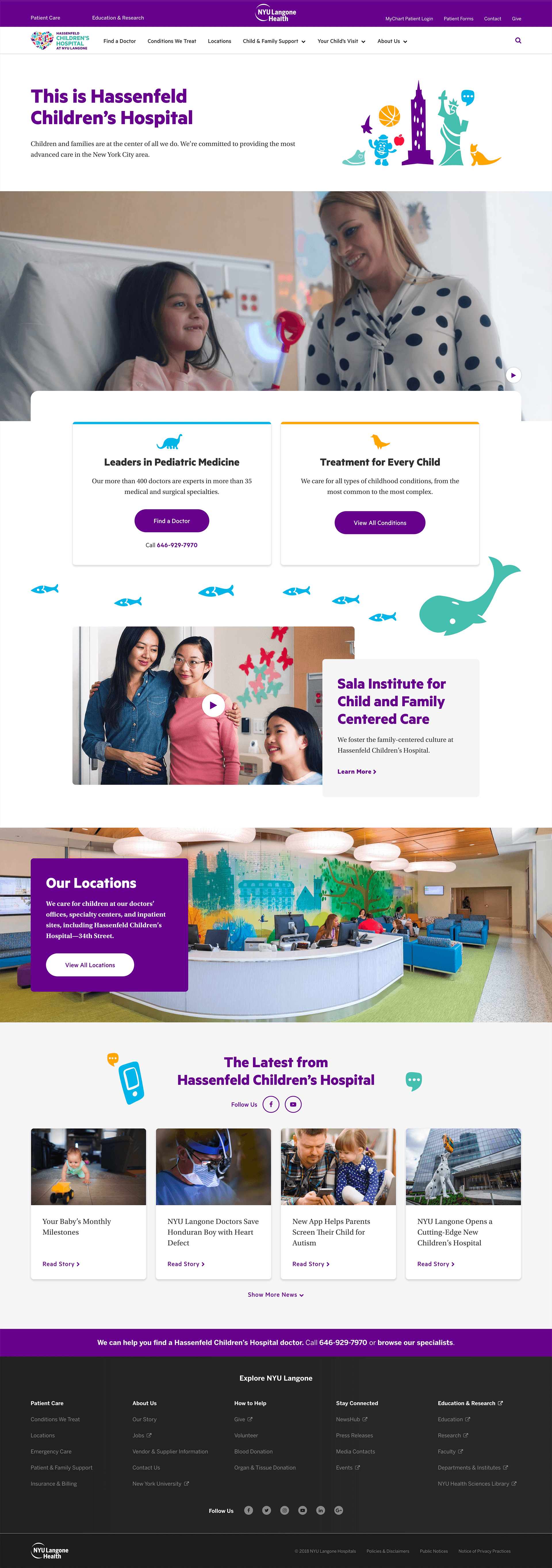
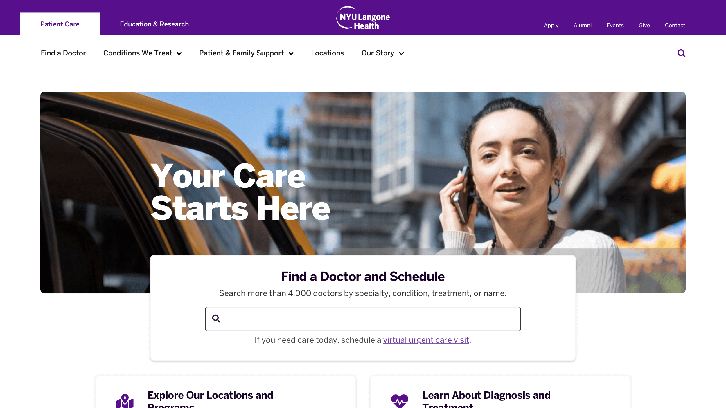
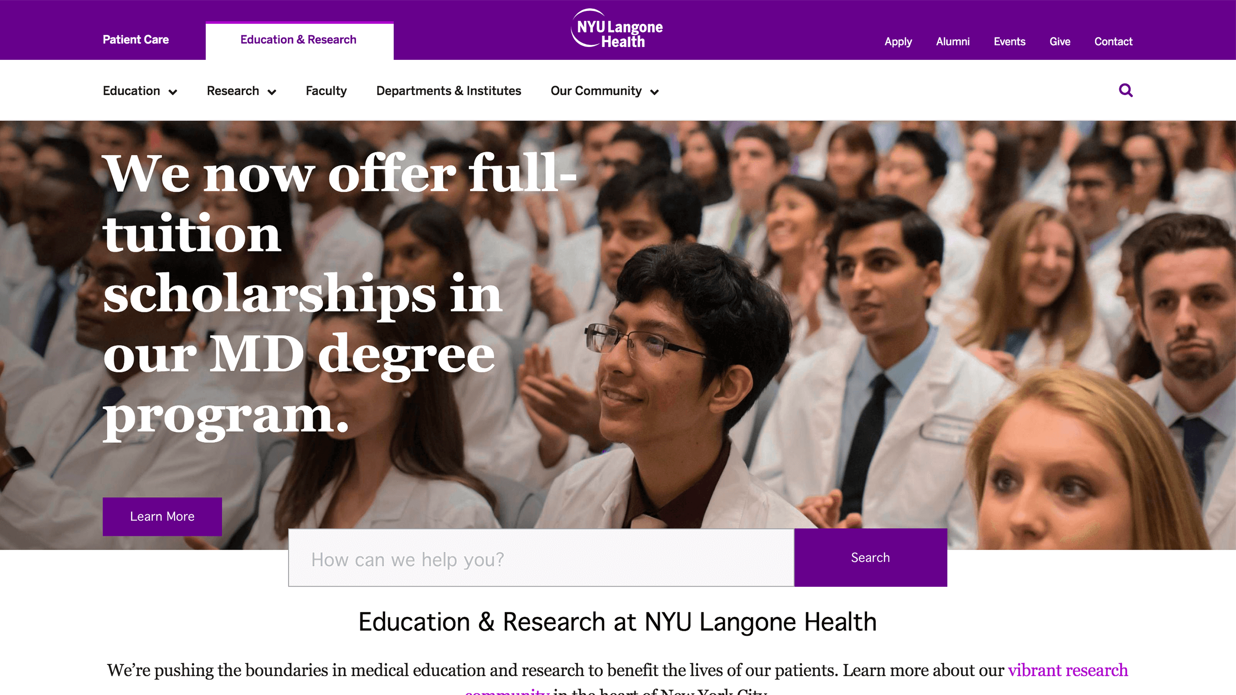
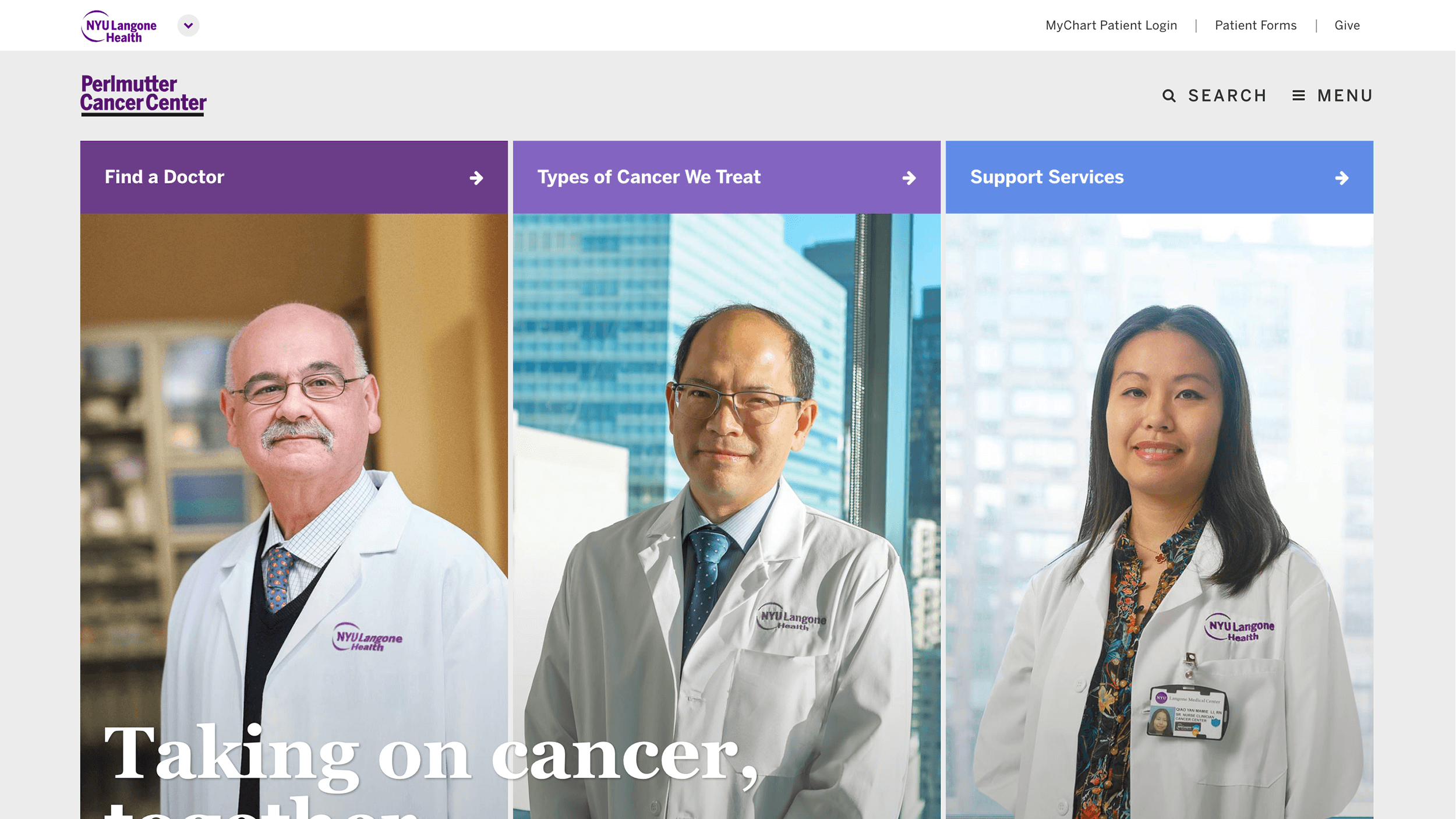
 Hassenfeld Children’s Hospital at NYU Langone
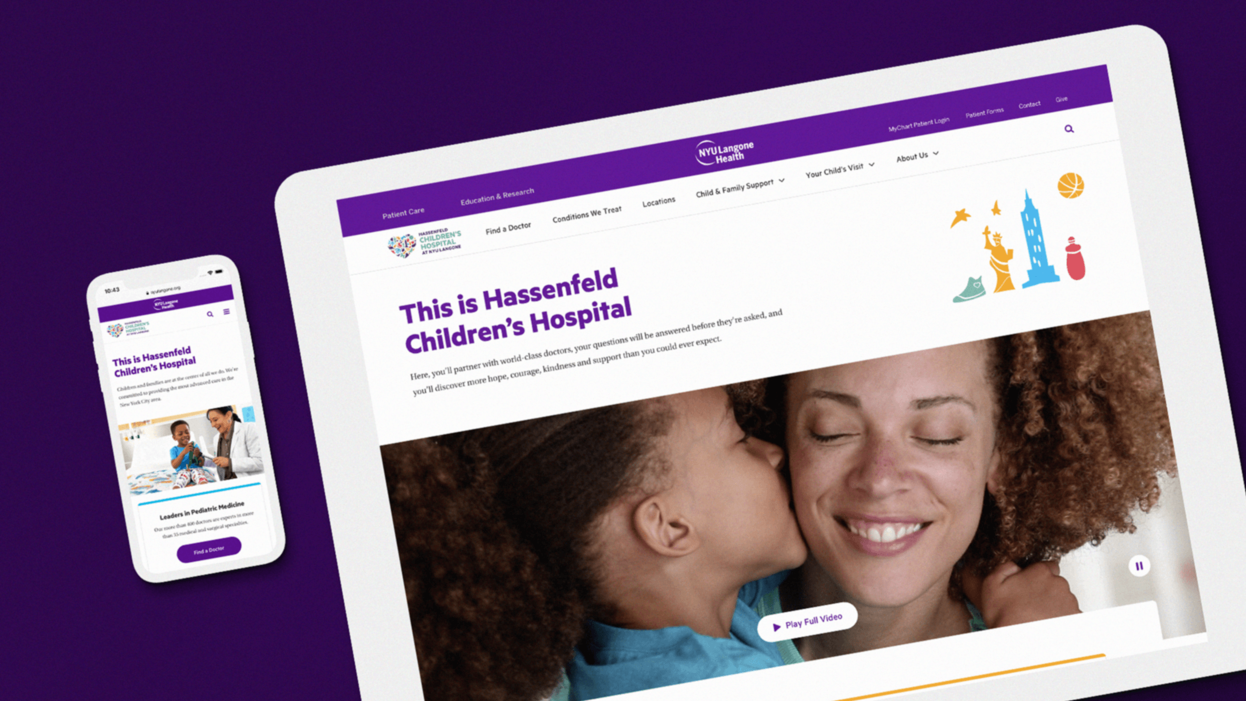
Redesigning the Hassenfeld Children’s Hospital’s website to provide a branded and tailored user experience for parents and caretakers.
To begin the project, we started by conducting user research sessions and competitive analysis to understand what the users are looking for when visiting a children’s hospital’s website. After understanding what the users’ needs are, we proceeded to drating the new information architecture and how user flow should be.
After laying out the fundamental of the site. we moved onto refining the wireframes and conducting user testing sessions to confirm all the hypothesis has been proven right. We then moved onto setting the branding guideline, design system and created the visual designs based on the system established.
After all static visual designs have been approved, we moved on to detailing the interaction design, working with the developers to ensure the end product passes visual qa.
User Research
We spoke with ten parents whose children have a range of medical conditions in an effort to better understand their mindset, needs, and challenges they endure while trying to find care.
-
Condition is the #1 priority
When searching for care, parents are focused on if a hospital specializes in their child’s specific condition and if that doctor is among the best in what they need.
They are less concerned with the breadth of specialties a hospital treats.
-
Parents want to feel reassured and in control
Parents come to the site for serious conditions. They aren’t doing casual research.
They are stressed and don’t know who to trust.
-
Doctor/family partnership
Parents need reassurance that the doctor they choose will treat them as a partner in the care of their child.
They also want to know that the doctor will form a relationship with the child.

Competitive Analysis
We analyzed how other children’s hospitals, in the US and around the world, treat their doctor finding mechanism. With a focus on “what patients can search for” and “what filters are available.”
-
Competitors
-
Primary Competitors
- Seattle Children’s Hospital
- Colorado Children’s Hospital
- Boston Children’s Hospital
-
Secondary Competitors
- Children's National Health System
- Children’s Hospital of Philadelphia
- Texas Children's Hospital
- Children’s Hospital of Pittsburgh/li>
- C.S. Mott Children's Hospital
- Rady Children's Hospital
- Kravis Children’s Hospital
- Morgan Stanley Children’s Hospital
-
-
Conclusion
Parents come to the site for serious conditions. They aren’t doing casual competitive-analysis.
-
Most Common Filters
Location (8) > Gender (7) = Specialty (7) > Language (5) > Distance (4)
-
What Can People search
Last or First Name (7) > Specialty (6) > Condition (4)
-

Information Architecture
With the user researches, we drafted an information architecture that provides a user journey that’s optimized for parents to validate the doctors, specialties, hospital, and make an appointment with the doctor. Which are the most important qualities they look for when choosing a hospital.

Redesign
Started the redesign by creating new systems for color, typography, and iconography with family-centric and warmth in mind. We crafted more than 100 unique designs for desktop, tablet, and mobile, templates that supports 1,000 pages of content, 120 photographs, 2 new videos, and 6 custom-designed vignettes
